If you’re my age or older, you probably remember actually using a typewriter or word processor to type up reports for school. You didn’t have a choice as to which font to use. Now, however, there are a plethora of fonts available. A problem with having so many choices is that some fonts just aren’t very readable, especially for people with reading disabilities.
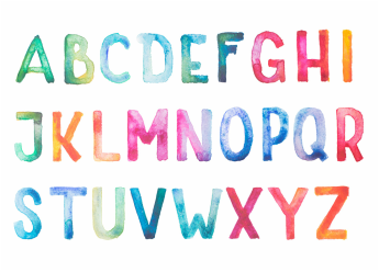
If you are interested to see what it might be like to have dyslexia, Daniel Britton, a graphic designer, took the Helvetica font and recreated it to mimic what a dyslexic person may feel when trying to read. The typeface he created is NOT what a dyslexic truly sees; this exercise is simply to mimic the feelings of frustration when reading. Dyslexics can see the words on the paper just fine, but there is a disconnect between what is seen and how the brain processes it, therefore slowing down reading ability.
Check out the alphabet:
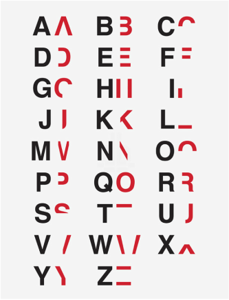
You can read a passage using his font on his website.
If you are dyslexic, a teacher of students with disabilities, or type reports for someone who is dyslexic, there are some fonts that are more readable than others.
Comic sans, though very informal-looking, is very readable. The single-story “a” makes it especially good for younger readers, who may not have had much exposure to the double-story “a” and may not recognize it as easily. However, many people do not like the look of Comic sans.
 | Another option is Century Gothic; it also uses the single-story “a”, is very readable, and looks less informal. There are also fonts designed specifically with dyslexics in mind. One is called “Dyslexie”. It is free for home use, but there is a charge for education or business uses. You can order it for free home use here: http://www.dyslexiefont.com/en/ |
| “OpenDyslexic” is another available font developed specifically for dyslexics, and the one I use when creating Orton-Gillingham lesson plans for my clients. Although not a cure for dyslexia, it does seem to help my clients decode words and differentiate letters. Additionally, it is 100% free! You can download and use it on your Mac, PC, android, and iPhone. Get it here: https://gumroad.com/l/OpenDyslexic | 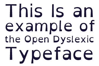 |
 RSS Feed
